
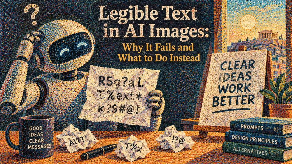
Every other generative failure has degrees. A slightly wrong shadow is usable. A slightly wrong face at a small size is often usable. Type has no degrees. The word is right or the frame is dead, and "nearly right" is the most dangerous outcome because it survives a quick review and reaches a client.
Why it happens
A model trained on images learns letterforms the way it learns brickwork: as a texture with statistical regularities. It has learned that a label carries marks of a certain density, that certain shapes follow certain other shapes, and that the whole thing has a particular rhythm. What it has not learned is that the marks are symbols in a system where substituting one changes the meaning entirely.
That is why the failures look the way they do. Plausible near-words with believable kerning, every letter frequency where a reader expects it. It is producing something shaped like the word, and shape is what it was optimising.
What improves it, and by how much
| INTERVENTION | EFFECT | NOTES |
|---|---|---|
| Fewer characters | Large | One short word is usually achievable. A sentence is not. |
| Flat, front-on surface | Large | Curvature, perspective and reflection each multiply the failure rate. |
| Larger in frame | Moderate | More pixels per glyph is more room to be right. |
| Naming the typeface character | Moderate | "Heavy condensed sans" constrains the shapes it is choosing between. |
| Saying "no other text in frame" | Moderate | Prevents invented signage appearing elsewhere, which is a separate failure. |
| Higher resolution | Small | Widely recommended, mostly does not help. |
| Regenerating repeatedly | None in expectation | The success rate does not improve with attempts. It is the same die. |
The last row is the expensive one. Teams burn very large amounts of budget re-rolling a packshot in the belief that the next attempt is more likely. It is not; each attempt is independent, and a shot with a low base rate stays at that rate however frustrated you become.
The method that works
- Generate the plate with the type deliberately absent. Ask for a blank label, a plain surface, an unmarked panel. Blank surfaces have a very high acceptance rate.
- Set the real type in post, using the actual brand typeface, at the correct size, with the correct tracking.
- Match the surface: warp the type to the geometry, match the lighting falloff across it, add the same grain and the same slight defocus the surrounding area has.
- Match the wear. Real printed type on a real object has edge irregularity. Perfectly clean type on a slightly imperfect surface reads as a sticker.
- Check at 100 per cent and at thumbnail size. The join shows at one or the other.
The video case, which is worse
In motion, type has to be right in every frame and consistent between them, which multiplies the problem by the frame count. A label that reads correctly at frame one and mutates at frame forty is the most common product-shot failure there is, and it is invisible on a first playback at speed.
The checks: step through the clip frame by frame across the type, and pull the first and last frames side by side. Anything that has changed is a shot that will be caught by somebody else later.
The fix is the same and harder: generate the move on a blank label and track the type on in post. It costs an afternoon of tracking. Forty failed attempts cost three days.
When to accept generated type
- Background signage that is deliberately out of focus and not readable. State that it must be illegible. Hoping is not an instruction.
- Foreign-language texture where no viewer is expected to read it, provided you are certain it does not accidentally say something.
- A single very short word, front-on, large, in a register that is not photoreal.
- Never on a product label, a legal line, a price, a claim, or anything a regulator could read.
The number that explains why a shot with legible packaging costs three or four times what an environment plate does.
WHY TYPE DESTROYS YOUR ACCEPTANCE RATE →